
I had this quesition when preparing my manuscript and a quick search brings me to this stackoverflow question by Johanna. I find the answer by Henrick to be highly effective, but can be further elaborated so that readers can be clearer about the functions of each line. Thus, I will base my post largely on Henrick’s answer but at the same time add my explanation to the rationale behind the lines.
Aim:
turn the following data’s plot into a bar chart with bars and labels between the tick marks.
library(ggplot2)## Warning: package 'ggplot2' was built under R version 4.0.5library(reshape2)## Warning: package 'reshape2' was built under R version 4.0.5data <- data.frame(name = c("X","Y","Z"), A = c(2,4,6), B = c(1,3,4), C = c(3,4,5))
data <- melt(data, id = 1)
print(data)## name variable value
## 1 X A 2
## 2 Y A 4
## 3 Z A 6
## 4 X B 1
## 5 Y B 3
## 6 Z B 4
## 7 X C 3
## 8 Y C 4
## 9 Z C 5ggplot(data, aes(name,value)) +
geom_bar(aes(fill = variable), position = "dodge", stat = "identity")
Here is Henrick’s working answer. I choose to focus on the second version, but the principle to plot the two graphs is the same. To convert to the first version the only thing that needs to be tweeked is the number of tick marks.
data$x <- as.integer(as.factor(data$name))
x_tick <- c(0, unique(data$x)) + 0.5
len <- length(x_tick)

ggplot(data, aes(x = x, y = value, fill = variable)) +
  geom_col(position = "dodge") +
  scale_x_continuous(breaks = c(sort(unique(data$x)), x_tick),
                     labels = c(sort(unique(data$name)), rep(c(""), len))) +
  theme(axis.ticks.x = element_line(color = c(rep(NA, len - 1), rep("black", len))))
Explanation
Preliminary steps to prepare the data needed
I have transferred some of Henrick’s code into tidyverse to make it self-explanatory. Some of the objects will be explained later.
data$x <- as.integer(as.factor(data$name))as.factor() converts the name of the elements of x-axis into unique levels and as.ineger() converts them into numbers. Thus, data$x is the numerical representation of the elements of the x-axis. Basically it uses different numbers to represent the different values on the x-axis in place of the categorical names.
x_tick <- c(0, unique(data$x)) + 0.5
len <- length(x_tick)
x_tick is the sequence from 0.5 to 0.5 + the maximum value of data$x i.e. the number of labels along the x axis. If x-axis is the number line, the position where bars and labels are placed should be the integer values and the tick marks are placed at x.5.
len represents the number of tick marks.
Step by step analysis of ggplot function
# ggplot(data, aes(x = x, y = value, fill = variable)) +
#   geom_col(position = "dodge") +
#   scale_x_continuous(breaks = c(sort(unique(data$x)), x_tick),
#                      labels = c(sort(unique(data$name)), rep(c(""), len))) +
#   theme(axis.ticks.x = element_line(color = c(rep(NA, len - 1), rep("black", len))))
The following part is self-explanatory and covered in standard textbook like R4DS.
ggplot(data, aes(x = x, y = value, fill = variable)) +
   geom_col(position = "dodge")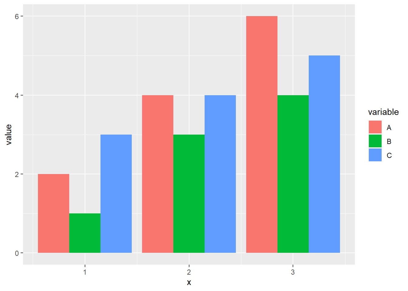
First part of scale_x_continuous code:
# scale_x_continuous(breaks = c(sort(unique(data$x)), x_tick), ...)unique(data$x)
sort(unique(data$x))data$x has been explained above. unique() generates the unique values of data$x. sort() will sort the unique values in ascending order.
c(sort(unique(data$x)), x_tick)What c() does here is just to combine the x_tick and sort(unique(data$x)). This creates the all the x-axis tick marks. However, not all tick marks will be shown because of the colour setting in theme() setting later.
Second part of scale_x_continuous code:
# scale_x_continuous(...,
#                      labels = c(sort(unique(data$name)), rep(c(""), len)))
Breakdown:
data$name## [1] "X" "Y" "Z" "X" "Y" "Z" "X" "Y" "Z"data$name are the labels that will be placed at the integer values of the number line.
unique(data$name)
as.character(unique(data$name))
sort(as.character(unique(data$name)))
unique(data$name) will output the unique values (i.e. levels) of the labels. as.character() turns them from levels, whose types are integers, to characters. sort() will sort them in numerical order so that the labels corresponds to the breaks set in the previous line of the code. It does not produce any effect in this demo code because the charcaters are already sorted in alphabetical order.
rep(c(""), len)## [1] "" "" "" ""len was created earlier to be the number of tick marks. We want the labels at the tick marks to be nothing so we use "". rep() creates the first argument ("") for len times.
scale_x_continuous put together
c(sort(unique(data$x)), x_tick)## [1] 1.0 2.0 3.0 0.5 1.5 2.5 3.5c(sort(as.character(unique(data$name))), rep(c(""), len))## [1] "X" "Y" "Z" "" "" "" ""So these are the full set of x tick marks location and their corresponding x labels aligned vertically. We have the labels on the integer values of the number line and “” on the x.5 values of the number line. The graph we generate so far looks like this:
ggplot(data, aes(x = x, y = value, fill = variable)) +
  geom_col(position = "dodge") +
  scale_x_continuous(breaks = c(sort(unique(data$x)), x_tick),
                     labels = c(sort(as.character(unique(data$name))), rep(c(""), len)))
What we want to do now is just to remove the tick marks right above our labels. To do so, we will set the colour of those tick marks to be
 NA:
Remove tick marks above our labels:
# theme(axis.ticks.x = element_line(color = c(rep(NA, len - 1), rep("black", len))))Breakdown:
c(rep(NA, len - 1), rep("black", len))## [1] NA NA NA "black" "black" "black" "black"axis.ticks.x sets the options for x-axis tick marks. element_line is the only option for axis.ticks.x.
Thus, these are the three layers of the number line we have got:
# the location on the number line
c(sort(unique(data$x)), x_tick)
## [1] 1.0 2.0 3.0 0.5 1.5 2.5 3.5# the label on the number line
c(sort(as.character(unique(data$name))), rep(c(""), len))## [1] "X" "Y" "Z" "" "" "" ""# the colour of the tick marks
c(rep(NA, len - 1), rep("black", len))## [1] NA NA NA "black" "black" "black" "black"More discussions
So let’s say now I only want to keep the labels on the odd-number labels on the number line. This may not be so applicable in this case but it can help to reduce the crowdedness of the labels on an x-axis with continuous numerical labels. How can I do that?
The only thing I need to do is to set “Y” (or rather, all the even-number labels) to be “” for the row of the label on the number line. I can use a for loop to do so. Certainly I can use a look-up table as vectorised computation to improve efficiency. But it seems to me that for the small number of elements in x-axis, the performance improvement is negligible.
# first store what has been used as the x-labels in a new variable, labels
label <- sort(as.character(unique(data$name)))
even_num <- seq(2,length(label),2)

for (i in even_num) {
  label[i] <- ""
}
label
## [1] "X" "" "Z"Now I will plot the graph again, with sort(as.character(unique(data$name))) substituted as label
ggplot(data, aes(x = x, y = value, fill = variable)) +
  geom_col(position = "dodge") +
  scale_x_continuous(breaks = c(sort(unique(data$x)), x_tick),
                     labels = c(label, rep(c(""), len))) +
  theme(axis.ticks.x = element_line(color = c(rep(NA, len - 1), rep("black", len))))
Great. :smile:
Reflection: I think the most important lesson from this exercise is not how to plot a more customised bar plot, nor how to understand the different layers of ggplot. Rather, I appreciate this procedural approach that enable us to understand the functionalities of the code.